
Divi Builder Basics
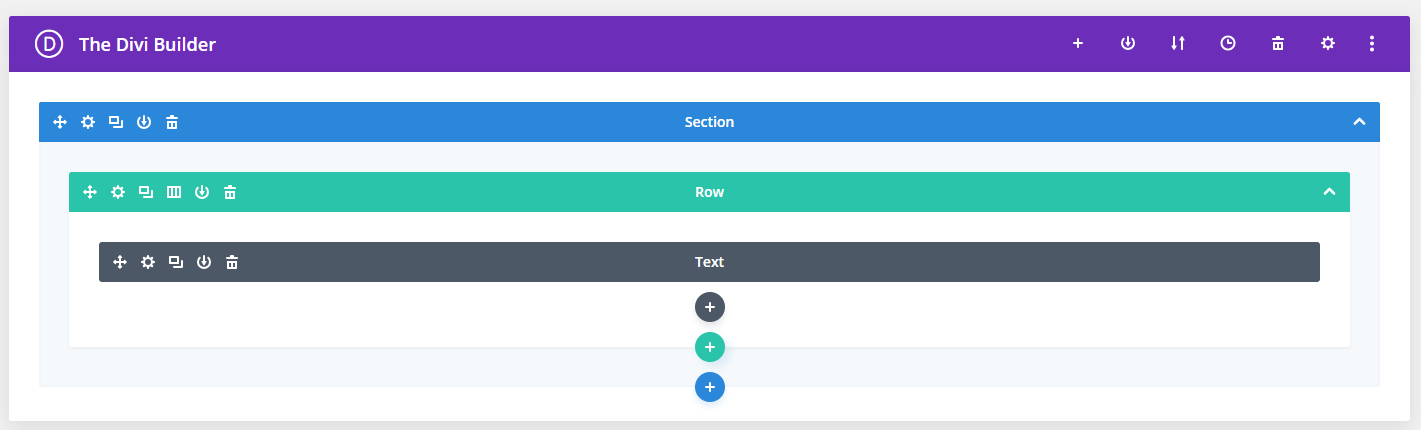
The Divi Builder
Looks and works much like the Visual Builder (read more here).
Terms
Module(s) = Building element used to create text, images, videos - you name it! Learn More on how to edit individual module types - Here!
Header = Full-width banner. Headers are the section under the main menu on most sites.
Layout Structure
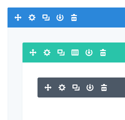
Blue Bar = Section | Green/Teal Bar = Rows | Gray Bar = Modules
Each area is highlighted with a specific color. See the notes above. Areas nest within each other. Such as first the section, then the rows, and lastly the elements/modules.
Icons
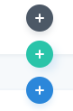
To Add new sections, rows, and modules
Click the circle with plus signs to add accordingly.
Blue Circle = New Section | Green/Teal Circle = New Row | Gray Circle = New Modules
To Edit, Move and Delete

Arrows = Move section, rows, modules - Drag and drop functionality.
Gear = How to open settings for sections, rows, and modules.
Boxes = Duplicate (clone) any section, row, or module.
Columns = How to change the layout and column structure. ie: Change the layout from 1/2 and 1/2 to 3 columns.
Download = Save any section, row, or module to the DIVI library to use later.
Trash Can = Delete.
Extra Features
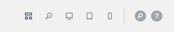
(left to right)
Layout Icon = Shows you everything
Desktop icon = Shows you what will only show on desktop.**
Tablet Icon = Shows you what will only show on a tablet.**
Mobile Icon - Shows you what will only show on mobile.**
Search Icon = Allows you to search to make quick edits
Question Icon = Get help from DIVI directly with videos, how-tos etc.
** Recommend you make edits on desktop view only. For Device-specific edits - Please reach out to support if you are planning on having elements show only on desktop/tablet/mobile.
Note: In 2019, DIVI made upgrades to their tools and layout options. If you are seeing the Classic builder - Read how to use it here!