
Testing A Website's Responsiveness
You can test the responsiveness of your website on the fly.
As we build new sections or layouts, it’s often quickest and more sustainable to check those as you go rather than wait until the entire site is built.
For example, if you're working on a custom header or footer layout, it's important to test the responsiveness of those (at various browser widths) as you add new elements to them. That way, as you “finish” one section, you can move onto the next page or section — knowing your previous section is now bulletproof.
In general, the following are the methods of testing responsiveness and cross-browser compatibility:
On Your PC
While it’s generally safe to assume that if it looks good in Chrome, it will look good in other browsers — testing should still occur in the below browsers on your PC. This is due to the fact that each of those browsers uses a different type of rendering/layout engine. But do keep in mind that Chrome is the dominant recommended browser.
Google Chrome (Blink)
Utilizing Developer Tools
- Adjusting Browser Width
- Adjusting Device Mode
Mozilla Firebox (Gecko)
Microsoft Edge (EdgeHTML)
- Requires Windows 10
Microsoft Internet 11 (Trident)
- May Require A Download If Not On Your PC
Alternative Devices
If you’ve done your due diligence and testing on the above browsers, it should just come down to ensuring if it looks good on other physical devices. Particularly within Safari, since thanks to the iPhone, that browser has a high market share of users. Safari uses a different type of layout engine, compared to the above browsers. It uses WebKit.
Google Android (Chrome)
Apple Macbook (Safari & Chrome)
Apple iPad (Safari)
Apple iPhone (Safari & Chrome)
Using Chrome Dev Tools
Many responsive issues can be resolved by testing within Chrome Dev Tools before viewing on a different device itself. In fact, one could argue that you should always be running your website with Dev Tools open, while building it. One tab for the admin side, and another tab to view the website itself (with Dev Tools active on that tab).
To open Chrome’s Dev Tools there are a few methods:
- F12
- Ctrl + Shift + I
- Settings Menu > More Tools > Developer Tools
- Right-Click > Inspect
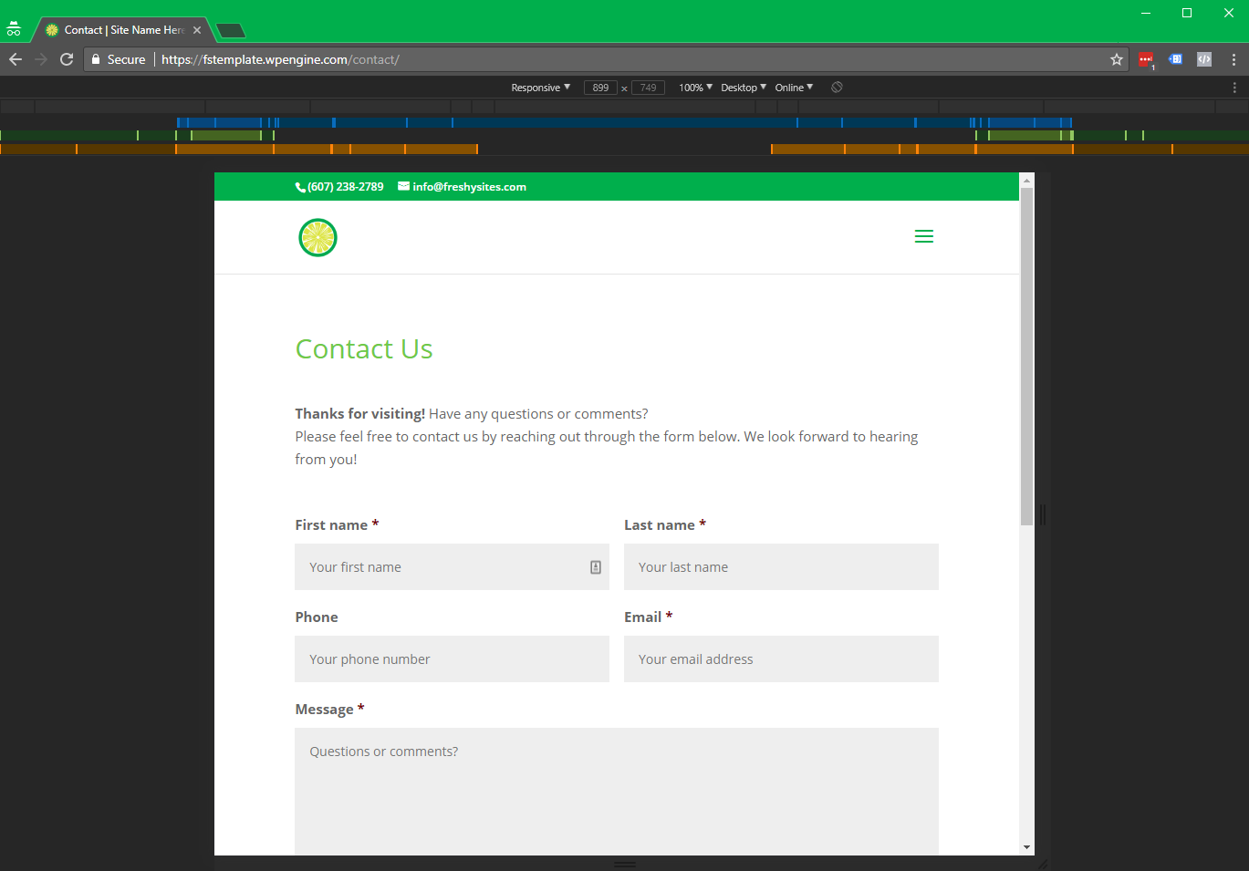
Once Dev Tools is open, you should enable the Device Toolbar (if it isn’t already) by clicking the little Devices icon:

This will add a section to your tab that allows you to easily adjust the width, height, device type, etc. and will look like this.
Test All The Widths!
You can easily test responsiveness by dragging the width of the viewport, to make it more narrow — without having to drag the browser window itself. Make sure the “Responsive” dropdown is set to Responsive, otherwise it will lock the size to a particular device size.
These days, devices can be almost any pixel width (and height), so the website should look good any pixel size - not just a select few.
Adjusting the width on the fly should help you see if a user will experience any issues at that particular width, such as wrapping header nav, improper wrapping of gallery/product grids, text columns that are too narrow, etc.
You should be testing ALL the way down to 320px wide. There are still mobile devices out there that are only 320px wide. If you test all the way down to that width in Dev Tools, very little should come as a surprise when you view it on the physical device.
Changing "Device" Type
While in Dev Tools, with the Device Toolbar active, you should see an option to toggle between:
- Desktop
- Desktop (Touch)
- Mobile
- Mobile (No Touch)
It’s recommended to test the website in both Desktop and also Mobile modes.
This is because many themes and plugins will change their behavior based on if it detects a mobile device compared to a desktop device. When toggling between device types, it’s best to refresh the page to ensure the page fully loads under that method.
Don’t confuse these device types (modes) with screen widths.
They are not the same thing. A “Mobile” device doesn’t automatically equal a smaller screen size. You can easily have a “Mobile” device type at widths beyond 980px (e.g., iPad Pro is a mobile device that goes up to 1366px wide).
Just the same, a desktop user could easily (and should easily be able to) browse a website on their PC at sizes smaller than 767px wide.
In most cases, testing exclusively in Desktop mode should be fine, but for any unusual custom websites, testing in Mobile mode should help ensure responsiveness and usability.
NOTE
While it's not exactly related to responsive testing or cross-browser compatibility, while working in Dev Tools, it’s often a good idea to keep an eye on the Console tab. This will alert you if there are any issues (particularly related to any jQuery or plugins), as well as any SSL issues that may arise. If you’re noticing any bugs/glitches, definitely take a look at the Console tab for any red errors.